BACKSTORY:
Back In 2016, we started OPTIO with a passion for technology and a dream to create something that would make a difference in personal finance management for Millennials.
At that very moment, it was unclear how this company would look or what visual identity it should have. As for every tech startup, the first goal was to develop a product that would solve a specific problem. Mainly working on financial data, we noticed that this data is very rich with insights, and banks are far behind tech giants in utilizing this information. So we worked hard to put together all the technology and experience and created the platform that helps banks bridge the gap between raw data and customer-centric campaigns.
As we reached this point and ensured product market fit, we realized that OPTIO craved a new and refreshed brand identity. To achieve this, we got together with marketing experts. They assisted us in analyzing and delivering Optio’s values and vision and shaping the brand that represents our passion and dreams.
BRAND PLATFORM:
We kicked off the process by creating a strategic brand platform. Together with Ucha Urushadze, an experienced brand strategist, we worked out the fundamental components that define Optio’s identity, values, vision, and value proposition.
During a dozen dedicated sessions led by Ucha, the team worked on creating the brand platform that offers the strategic foundation Optio needs for a cohesive brand identity. The final result has not only helped Optio throughout the rebranding process, but will also help the brand stay consistent and focused on its mission and values.
NEW VISUAL IDENTITY:
With the rebranding process well underway, it was time for a new visual identity.
We got straight to work, and together with the Creative Director, Giorgi Kvlividze, and Graphic Designer, Tengiz Begoidze, we sketched out various possible concepts. Both have brilliant track records and distinguished portfolios while working with trendy brands and marketing agencies.
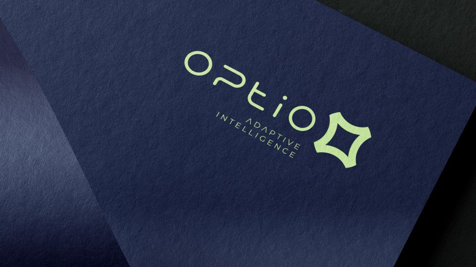
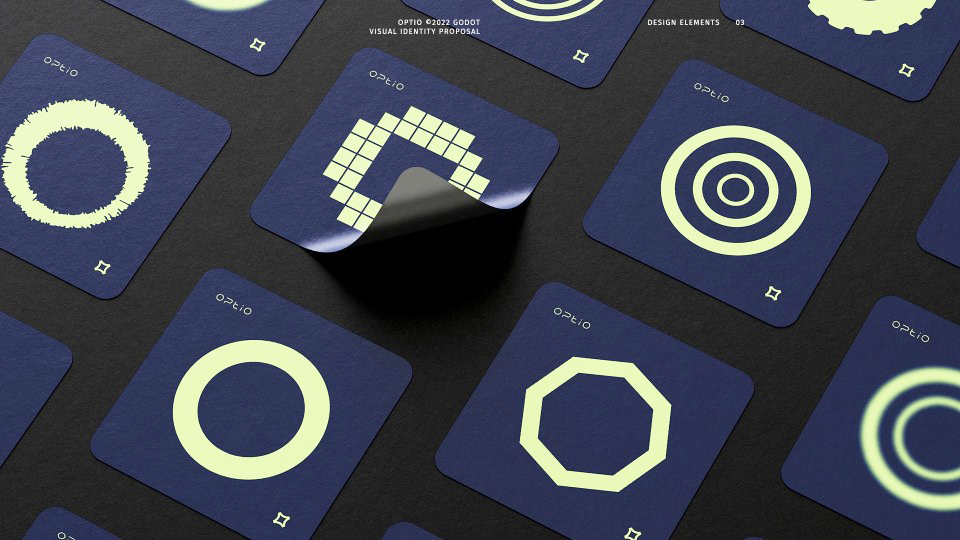
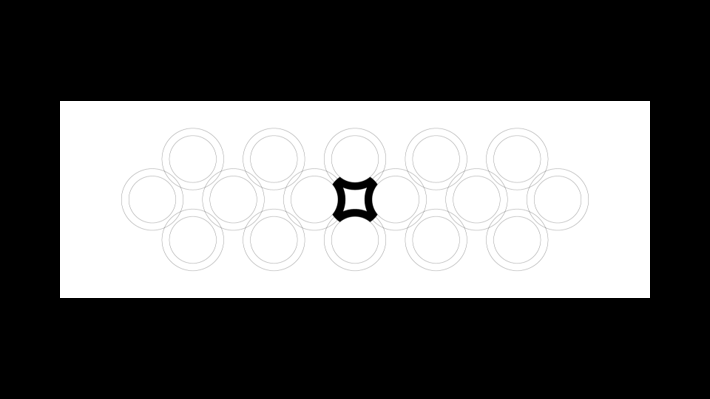
They considered everything from bold, modern logos to minimalist, symbolic designs. Finally, inspired by the letter ‘O’, we settled on a unique concept to construct a new logo representing the optimal intersection of O’s. The driving colours of the brand are mint and navy blue and are supported by black, white, and other simple colours that will be used across all channels. We like the simplicity and contrast of this minimalist palette, as it creates a neutral system to display our brand.
We’re delighted to share the new Optio brand identity, a project that reflects the collaboration of our team and superstar marketing professionals. All of this, and more, has made Optio the first customer data platform exclusively built for the financial industry.